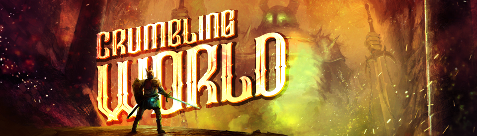
Crumbling World
UI, Communication And Usability
Hello everyone! I have been working on the main user interface (UI) for Crumbling World. UI is an essential part of any game, as it is one of the main tools that we as game designers use to communicate with our players directly. A well-designed UI has the power to convey the current status and progress of players, in addition to their current statistics, goals, and even the subtler points of a game’s storyline.

A Great User Interface is Within Reach!
As I have been a graphic and web designer for the better part of 15 years, I must say that a design background can be advantageous when working to great a robust UI. Regardless of your experience in graphic design, every developer can create a great UI if they put enough thought and effort into it. With this in mind, I thought that it could be helpful to share some tips that I have learned over the years that other game designers might benefit from when working to create their fantastic user interface.

Communication is Everything
As a graphic designer, I have learned the hard way that the best graphic design is that which excels at communicating as much as possible with as little as possible. While the famous quote, “less is more,” is undoubtedly overused in our everyday lives, it is also one of the most valid axioms for game design.
Thanks to my background, I have been a long time enthusiast of minimalist and elegantly simple designs. One of the main things that separate a strong designer from a weak designer is without a doubt their capability for synthesis. The ability to simplify something in its most minimal expression, all without losing its power to communicate to players, is one of the strongest tools that a game designer can apply to their creations.

Keep User-Friendly Design In Mind
While synthesis can be a powerful tool, one of the dangers of this method is that a design which has been oversimplified might not communicate what you are trying to get across, which can lead to confusion and frustration for players. This exact situation is why a well-known standard, called usability in web design, should always be applied to the user interface of your games. Sometimes, we fall into the trap of attempting to reinvent the wheel. If you find yourself going down this path, I would suggest trying to keep things simple. In short, don’t be afraid to use language and features that are already well known to gamers. For example, using green and red bars to represent the player’s remaining life points and damage will allow players to understand what is going on quickly. In other words, if your game doesn’t require a tutorial, it likely means that you’ve attained an impressive combination of playability and ease-of-use for your players, which can only help your end product succeed in the long run.

These are a few things that I always try to keep in mind when working to design the user interface for my video games. A little while back, I wrote a tutorial on displaying 3-D objects within your user interface: I invite you to check it out here to help you brainstorm further. I hope that this walkthrough has been useful as you work to better yourself along with your design journey. As always, thank you so much for reading, and feel free to check back often for more great game development tips and tricks!
Comments
Log in with itch.io to leave a comment.
I 100% agree with "less is more" with UI and your interface looks fantastic! I really like that bottom gif where the character is looking around with the spikey vines and purple magic glow. Great write up again, dude!
Thanks so much :-)